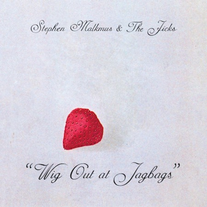
A couple of days ago, in the comment section of a Stereogum blurb teasing live versions of songs from the forthcoming Stephen Malkmus and the Jicks album, someone posted what might be a contender for the least compelling album cover in the history of cover art. It featured the band name and title, in curdled, almost unreadable script over a pale, mottled gray backdrop, with a shadow-casting strawberry floating in the center. The commenter simply posted this image, with no sidebar or caption to accompany it. I squinted in bewilderment, then chuckled to myself, because it had to be some ironist fan's idea of a sick joke: no way—man, no way—this abomination was green-lit for Wig Out at Jagbags. Not in a million years. It was simply too hideous, too pointedly discouraging, like a hastily Photoshopped cover for a live bootleg or something, the sort of shifty product you'd hop aisles to avoid in a record store or a sly goof on the cover for Kanye West's 808s and Heartbreak.
But of course, it's real. That is the cover; it’s not going to stop being the cover because we wish it were not the cover. Bright primary colors blocks and sprouts will not emerge from all that gray if we press forefingers to temples and concentrate. Nothing anyone does will make this sucker as visually inspirational as the previous five Malkmus album covers were—or even the various Pavement album, compilation, and CD-5 covers—and that's that. This is life. It falls within our power, though, is to divine Malkmus' reasoning here, to parse the whys behind this foray into what is, frankly, a realm of anti-art where all discernible semblances of joy and bounty are stripped away. (Have I mentioned that I'm allergic to strawberries? Well, I am.)
While reasonable strangers can agree that the Wig Out at Jagbags cover is as unforgivable as the album's own title is unfortunate, we can also agree that it's greatly unlikely that anyone wandering into an FYE in mid-January will encounter a huge poster of the album cover's likeness flanking a massive retail display pimping this record; more likely some underpaid minion will slip a few copies into the miscellaneous "M" section, and that will be it. More people will mail order or legally download it, making it less a shared cultural event than a disembodied one, at least until the tour kicks off. Malkmus doesn't have to cater or capitulate to anybody: the people who will queue up for this album would have done so regardless of the title or cover image. The man has long pursued whims to great effect on wax, and that impulse has finally leaked through to the presentation. The timing is perfect: this is an era when presentation matters less than the music, and when the music matters less than the lifestyle it purports to evoke. Let's pray the music here outstrips the presentation by some distance; if it does, the presentation and the marquee can be designated as "quaintly ironic."

