Angela Merkel’s leadership style is described by The Times Literary Supplement, which reports that her approach “mingles an ability to hang back and observe the public mood.” Okay, with what? Mingles that ability with what? With nothing, for there the sentence ends. One might say Merkel’s style features the ability. But the writer chooses “mingles,” as in “green mingled with blue,” “happiness mingled with regret.” Two or more things are needed. The writer, seeing two components to the Merkel approach (hanging back, listening), decides that these are two things. But when she picks words for her sentence, the two things collapse into “ability.” Which makes sense, since hanging back and listening do seem like one knack. On the other hand, word never reached the start of the sentence. Merkel’s approach “mingles an ability”!
Here’s another freak. The lead describes Merkel as headed to “what looks like an unbeatable fourth term as German Chancellor.” Bad prophecy aside, Merkel’s term wouldn’t be vanquished or not vanquished; Merkel, in her search for a term, would be vanquished or not vanquished. So far, of course, she’s managed to be neither, submitting to a weightless situation that resembles this article’s low-grav approach to word use. With the TLS, grammatical items as sturdy and simple as adjective and noun can go floating apart. Dangling participles have always been a nuisance, but now we have the dangling adjective.
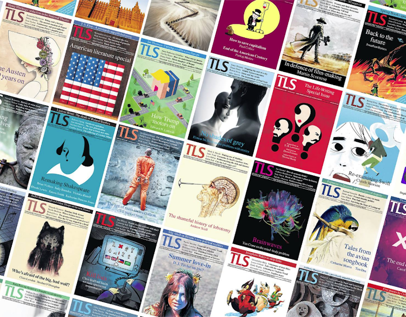
A TLS page looks all right. The text parades in solid column after column, clad in a typeface that gives the effect of high-spirited formal wear. Even the sentences seem to shape up, at least when you stick to their outlines: no run-ons, no lop-sided shamblers. But within the sentences the loopiness runs deep. Maybe the publication’s word use would steady up if type size grew larger. Perhaps the TLS is understaffed but bent on keeping its page’s look, which includes type of a certain size and no larger, and the hard-pressed staff is told to handle copy like it was supermarket produce. Goods are patted into a correct-looking heap, and nobody asks about underneath.
If that’s the game, what a game it is. The TLS wants to look like a bastion of print culture, like a publication that’s there to be read. But attaining this look means skimping on the coherence of what, supposedly, the people will be reading. Management goes ahead and skimps. In its view, people should be able to pick up a copy, find an Alma-Tadema reproduction flush with color, a painting of a horse printed to similar standard, and pages of text that looks and tastes like text. When the reader’s eye alights on a sentence, that sentence should flow properly and employ serious words. And there the duty of the text ends. The important thing is the horse and the type size. Meanwhile, the adjectives float free.
—Follow C.T. May on Twitter: @CTMay3

