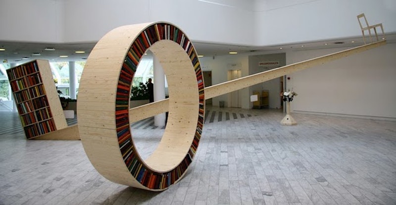
This circular bookshelf, or “Archive II” by David Garcia, is a whole lot of awesome, even if every aspect of it is patently impractical. The construction presumes that you have unnaturally durable books which can endure endless tectonic shifting and the angry forces of gravity; that your bookshelf is completely full at all times (to prevent avalanches); and that we all inhabit a featureless sphere that would provide no impediments from one location to another.
Most of the reaction to this art/design project seems to be comprised of people asking “Why?” I think that the possible retort, paraphrasing Robert F. Kennedy, to defend against this astute viewpoint is “Why not?”
There is no written rule of design that states design needs to be practical. Ergonomic design must appeal to the needs of human beings, but the more nebulous term of “design” refers the imagining or re-imagining of a concept into form. I believe that the art of impractical design is a far more effective commentary on the nature of design itself than completely practical designs can be, like the soft sculptures of Claes Oldenburg. They question tradition, and revitalize our perspectives on why we do what we do—and it generally reveals a lot of bad habits, which we could stand to break.
There are also no rules that dictate we need to design for known elements. Should a design emerge that appeals to the 18 tendril fingers of an alien race, which has not yet made contact with us, that object is not automatically disqualified as a “design.”

That said, this is an incredibly witty commentary on the proliferation of e-Readers and Nooks and Kindles that are slowly encroaching into the territory traditionally defended by the noble bookstore, and the diminishing scale of how information is stored. I’ve worked in a library for over a decade, so while I appreciate the preciousness of books, I’d very quickly accept a viable alternative to checking in the hundredth romance paperback that arrives across the desk covered in an oily substance we’ve yet to identify definitively, but is likely biological in nature.
Using some rough librarian math, let's estimate that this object is about eight feet tall, meaning that there's a little over 25 feet of space for books per side, laid out based on the external circumference. A traditional bookshelf measuring eight feet tall would hold over twice as many books, though it wouldn't be nearly as fun. Perhaps the main flaw in the project is the designer’s attempt to define the object, instead of presenting it in the perfect artistic vacuum.
“Archive II” is part of a series of three different book-themed works which relate to how the reader and literature interact in the physical world, so while none of these ideas would ever comfortably sit in a respectable library, they definitely look neat in the gallery. Let's ignore the irony that a device ostensibly designed to transport books needs to be taken apart to be transported to the next gallery.

