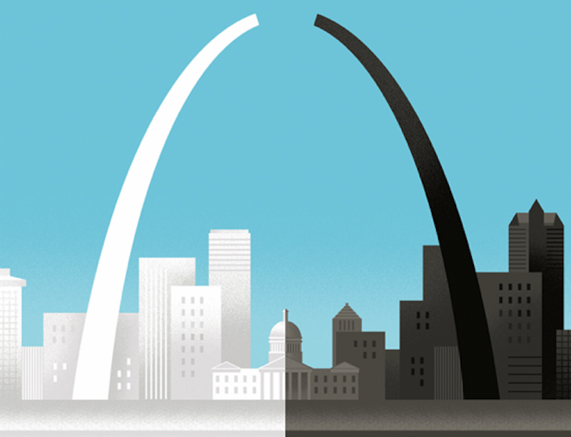
As the highest profile venue for occasional illustrations in the country, it was inevitable that The New Yorker would address the Ferguson verdict. Art editor (and alt-comics legend) Françoise Mouly called on former St. Louis native and illustrator Bob Staake for the job, and he turned in a picture of the St. Louis arch, broken into two halves, one white, one black—an image that aspires to sum up the tensions in the city and the country in a single iconic curve.
The cover has already received a lot of praise; its simplicity has an immediate appeal. Unfortunately, in this case, simplicity is less a virtue than an excuse for pious banality. Staake, in an interview at the New Yorker’s website, said that he wanted to "comment on the tragic rift that we're witnessing," and that's exactly what he does. On the cover, the sides of the arch reach up, one black, one white, both equal but separated. The space between the two of them is the tragedy; empty, unexplained, unfilled. Why won't the two sides reach each other? Why must there be this sad disconnect? The cover contemplates the question heroically, in clean lines and pale pastel blue. The pity here is smooth, untrammeled by unnecessary detail or culpable perpetrators. "At first glance, one might see a representation of the Gateway Arch as split and divided, but my hope is that the events in Ferguson will provide a bridge and an opportunity for the city, and also for the country, to learn and come together," Staake declares. If only we'd reach out to each other, our architectural wonders would be healed, and all would be right with the skyline.
Back here in America, though, solutions aren't as facile, and hope is harder to come by. The black and white people of Ferguson are not living in some sort of visual analog of Plessy v. Ferguson, separate but equal. The problem is not that the two sides of the arch, black and white, are tragically separated, and both need to work equally to bridge those misunderstandings. It’s that we live in a country that had slavery for hundreds of years, Jim Crow for another century after that, and more recently, funds a gigantic law enforcement system which targets black people for humiliation, imprisonment, and death.
At the same time, as the Ferguson DA was explaining why he'd rigged the grand jury so that Darren Wilson would not face trial for shooting an unarmed black child, Marissa Alexander was being sent to jail for firing a gun in the air, hurting nobody, in order to protect herself from her abusive spouse. In Chicago, where I live, black victims accounted for 23 of 27 police shootings in the first half of this year. These events aren't accidents; this isn't a gap in understanding or an oversight in civic infrastructure. It's a calculated, centuries-long campaign of terror. Treating it as some sort of failure to reach out to each other is so naïve as to be actually malevolent. Staake thinks he's representing a tragic truth, but really, in comparison to the situation in America, what he's got there is a utopia. Would that black people were able to go into one half of the city and be safe there from white cops shooting their children.
In an article for my comics website, the Hooded Utilitarian, art historian Matthias Wivel noted that, not always, but mostly, The New Yorker has been "a deadening force at the heart of [cartooning] smothering the field in bourgeois mediocrity." Wivel goes on to add that "The New Yorker's cartoonists almost never managed to comment intelligently—or indeed at all—on the important events of their time, be it the Great Depression or the Second World War, the civil rights movement or Vietnam." Wivel is primarily talking about the interior cartooning, but this cover seems to fit broadly in that same tradition of lazy, supposedly urbane mush, committed to providing comfort for the comfortable. People are marching for justice in the streets, and all The New Yorker can do is contemplate the folly of it all from a pious distance. They might as well have just drawn yet another picture of the Statue of Liberty weeping. Everyone loves that one, right?
Earlier this year, The New Yorker did print a Ferguson cover by reliable lefty Eric Drooker which actually engaged with injustice and situated the viewer, not at some Olympian remove, but with those confronting power. It's a shame that the magazine has reverted to type—and more of a shame that, given two covers about an injustice directed against black people, Mouly didn’t come up with an African-American artist for the assignment. I'm not sure what Kyle Baker or Kara Walker would have done with this assignment, but I’m certain that the takeaway would not have been that if only black people and white people leaned towards each other a little more, America would be healed.
—Follow Noah Berlatsky on Twitter: @hoodedu

