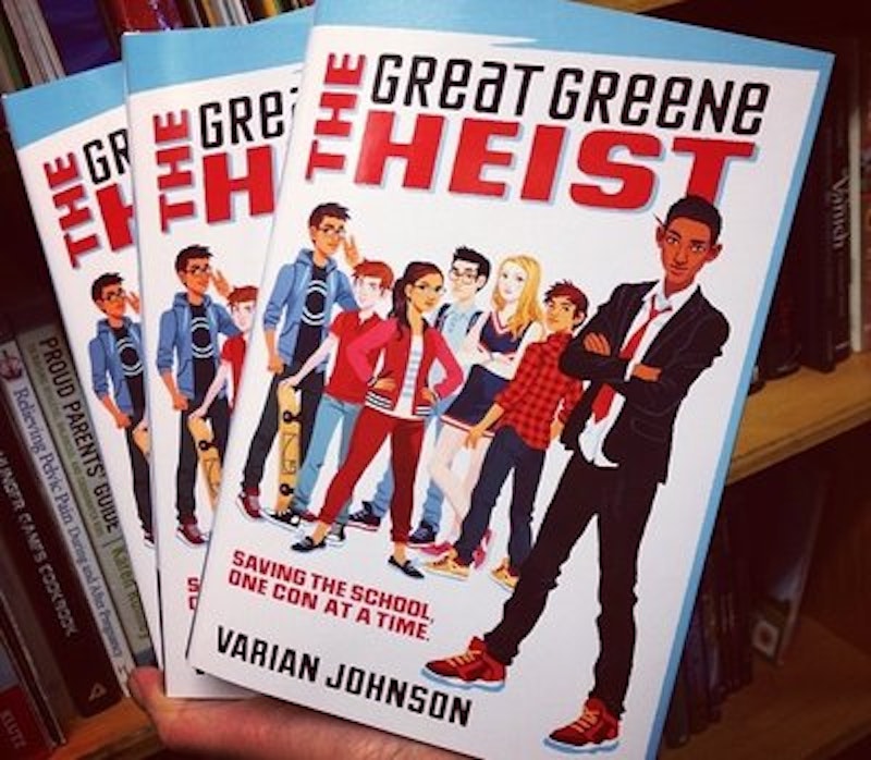
Look at the cover above. What do you see? Who are these kids?
This is Varian Johnson's The Great Greene Heist, a children's book out this week about a plot to steal a middle-school election. The book has been praised for its diverse cast. That diversity comes across in the cover illustration; you can see right away that the kids are of various shades and ethnicities.
When you get down to figuring out what those various ethnicities are, though, it gets a little trickier. The blonde girl and the redhead are clearly meant to be whites of European descent. The girl with arms on her hips though, she could be Latina, or Asian, or Native American, or maybe Southern European. And the main character, over there on the right with his arms crossed: is he supposed to be African-American? Or South Asian? Or he could be white, truthfully. It's hard to say.
In the book, the main character, Jackson Greene, is African-American. But that's difficult to convey instantly and unambiguously through illustration. In part, that's because the iconographic history of representing non-white people is so closely tied to the history of racism. The way comic books, for example, have in the past signaled that someone is black is through the tradition of blackface caricature, a tradition tied to minstrelsy and explicit racism. Similarly, Asian stereotypes—for example of the Japanese in World War II—used exaggerated features and outright dehumanization to mark a particular person as non-white. The illustrator here is avoiding caricature, and as a result he avoids the (racist) markers that tell us for sure what races we're looking at.
Of course, there are other illustrative traditions, not least those by black people themselves. Cartoonist Alan Dunne didn't fall back on blackface markers to illustrate African-Americans—he just used a little shading. The result is more stylish, but not different from what the illustrator of The Great Greene Heist is doing
That similarity extends to the indeterminacy. The exact race of the non-white people in Dunn's image isn't necessarily clear, any more than you can tell whether the white people are supposed to be of English descent, French descent, or Irish or Jewish. Without the marks of racist caricature to tip you off which ethnic group is being depicted, race becomes much less determinate or fixed.
You could see this as a problem, or as a failure on the part of the illustrator of the Great Greene Heist. But it seems to me that it's a feature, not a bug. There are lots of offensive things about racist caricature, but one of them is that the caricatures suggest that race is this natural, instantly recognizable, all-defining thing. Racist caricatures like Winsor McCay's Jungle Imp or Dr. Seuss' anti-Japanese propaganda don't even look human. The way we recognize those images as showing a particular race is by making that race subsume their humanity. When you see them, you can easily see race, because race is all there is to see.
When you look around at people who are actual people rather than illustrations, though, race isn't so visually all-encompassing. Sometimes you can put people into a box fairly easily (like the blonde girl on the cover) and then sometimes it's not so clear. There are black people who have lighter skin than whites; there are Hispanics who are white and Hispanic people who are black; there are Asian people who look every which way. Abandoning racial stereotype on the cover of Great Greene Heist makes race difficult to read, but that's because the claim for, or insistence on, ease of reading when it comes to race is part of how racism works. Looking at someone doesn't tell you everything you need to know about them, and pretending that it does leads you to bad places. So I appreciate that the cover leaves you room to wonder about whom these kids are. If you want to know more, you've got to read the book.
—Follow Noah Berlatsky on Twitter: @hoodedu

