Mainstream American movies have never been worse. If you live in the multiplex like my family, you’ve no doubt gone numb from the yearly onslaught of half-brained sequels, adaptations, carbon mimicry, and glorified toy commercials that used to be relegated to the summer. Sharp, interesting movies with money are rare these days (The Dark Knight, The Social Network, There Will Be Blood, the last four Coen Bros. films); groundbreaking works are non-existent. Establishment directors like Steven Spielberg, Martin Scorsese, Ron Howard, and Terrence Malick think they’re fighting the good fight, which makes them so dangerous: their recent films are just as hollow and safe as the gunk Michael Bay picks out his belly button (i.e. Shia LaBeouf). Quentin Tarantino’s favorite films of 2011 are just boring. It looks like Comcast’s spank bank.
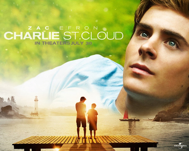
Nobody cares about aesthetics. Look at how disposable our movie posters have become. The posters for Transformers 3, Rise of the Planet of the Apes, Tron: Legacy, X-Men: First Class, Captain America, and Mission: Impossible—Ghost Protocol look like video game stills, and actors can’t make it onto their own adverts without suffering the horror of some Photoshop abortion. Zach Galifianakis, Bradley Cooper, and Ed Helms don’t even look like real people on the poster for The Hangover Part II. Poor use of digital illustration has left our posters and adverts shrouded in cold, unnatural lighting and boring textures. Movies and their posters should not look like video games. Video games graphics lack the emotional appeal of movies because their characters and actions are not alive and never were. We care about Solid Snake or Link because we play as them. Think you’d care at all if all you got were the cut scenes?
Photoshop and After Effects allow people to make promo material work because it’s easy. A blockbuster that would’ve had a beautiful painted advert 20 or 30 years ago gets a 10-minute rush job these days. These aren’t artists, they’re brain-soft technicians with no taste or sense of history. Flavorwire featured a great collection of movie posters from an alternate universe recently, with modern movies recast as vehicles for dead stars like Marilyn Monroe, John Wayne, and Cary Grant. The difference in posters here and those on buses now is striking. I bet you’d put that Kill Bill one up in your living room, but can you imagine hanging this stillbirth on your wall? What about this? Bottom of the barrel is our baseline now.
Photoshop and After Effects are easy and look okay but they don’t leave the same impression as practical effects, especially when the designers and editors are lazy and don’t care about the finished product. There were no hugely memorable or gripping scenes in Transformers 3 because the action is reduced to a big blurry mess of metal and earth. We’re mired in bad aesthetics because adequate design is simply more cost effective. Everywhere, intelligent and artful graphics are being dispensed with by the careless work of cheap, unsophisticated dills. You don’t necessarily need to paint all your posters, but please take some time into making the leading actors look like people and not shiny rubbery cyborgs out of an Xbox. Make them look human. Hollywood, if you’re going to rip people off with stale formula and non-content, at least make your posters good.
The Pitiful State of Movie Poster Art
Everything's worse than it's ever been.

