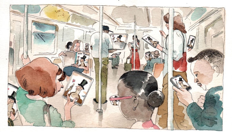
Yesterday, The New Yorker announced their new online look, claiming easier navigation on a desktop, tablet, or phone—the latter two being the main reasons, due to a growing readership through such mediums. They humorously, yet somewhat awkwardly, go on about their editorial and tech teams “sardined into a boiler room, subsisting only on stale cheese sandwiches and a rationed supply of tap water,” with an almost apologetic tone, as if preemptively placating those who might be disappointed by, essentially, the font and spacing increase, a recent trend in web design.
In writing this article, I've hit Ctrl [-] to decrease the font in the tab with The New Yorker's article, re-estimating the “classic” 12 pt. font size, whose default readability seemed to be okay up until now; that is, before handheld or "in transit" devices. Part of me wants to correlate increased fickleness with font size, imagining readers on the bus are less interested in a novel, or article, than a “Top 37 GIFs you must see before you die,” as in the style of BuzzFeed, whose list titles often evoke the reader’s mortality. Who can read a musty paperback of Death in Venice when your life is at stake? Or Anna Karenina at the train station?
Consider the condescending “publishing the best work possible remains our aim,” a line quickly snuggled in after a note about the iTunes App Store, Google Play, and Amazon, who they reference in the spirit of technological change. A more clandestine message lies herein, of an ominous second phase in the fall: the metered paywall. Hidden, like a virus. “You’ve likely seen this system elsewhere,” they dutifully note. Yes, I have. And I stopped reading.
I’m a fan of writers and editors getting paid what they deserve, which is a universal euphemism for “more,” and if subscriptions enable that, so then it must be; but I can’t help think of Condé Nast's (which owns The New Yorker) numerous travel, fashion, and lifestyle magazines, which are about 40 percent advertisements, and whose very content may even be sponsored. This will sound arrogant, but if anyone should be paying writers, it’s people who don’t like to read. Let them buy their nail polish and oxford shoes, turn to toast under a tropical sun, maybe a Cadillac Escalade to haul back the leather ottoman. They can spare a modest salary for a pasty curmudgeon at the desk, or a freelance writer paying rent. Call it Capitalist Socialism: the redistribution of wealth by a company. Who's laughing?
Let's remember The New Yorker’s 1925 inaugural cover featuring an esteemed gentleman, Eustace Tilley, inquisitively gazing at a butterfly through a monocle, likely a metaphor for selective cognizance. As online content becomes ever more cacophonous—with democratic peaks of brilliance, but often messy scribbles into the ether—print easily borrows from their austere legacy, asserting authority in the online sector.
A monocle is a corrective lens that makes something clearer without necessarily making it larger, as that would be a magnifying glass. Maybe they should redesign the first cover as well.

